Heroes, a company based in New Jersey, set out to capture the spirit of comic book memorabilia in their brand identity. They envisioned a bold, memorable mascot that could anchor their entire visual universe—bringing energy and a sense of adventure to every touchpoint of their brand.
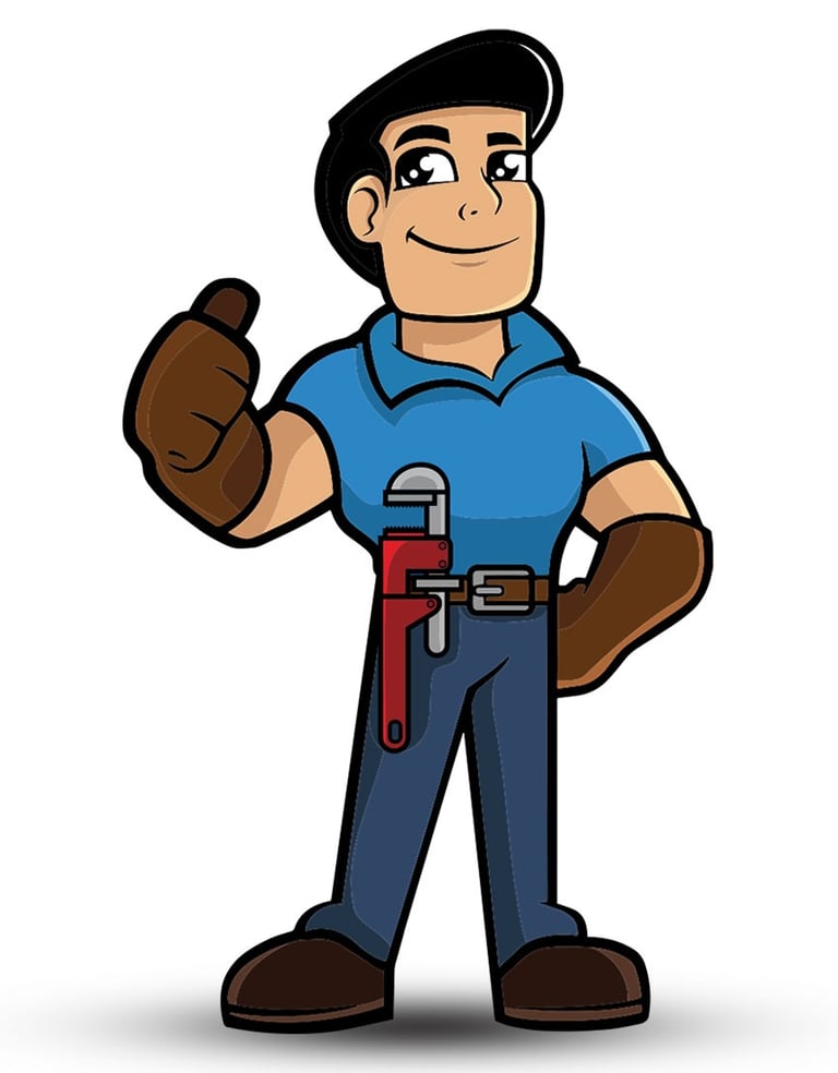
THE MASCOT
The mascot conveys confidence, professionalism, and trust—reassuring customers that the company is experienced and dependable. The thumbs-up gesture symbolizes readiness and a positive, can-do attitude. Finally, the wrench tucked into the belt clearly defines the company's core service: plumbing. It’s a visual promise that says, “You’re in good hands with us.”
This mascot character represents the entire Heroes team—professionals who, by the end of the day, become the true heroes, solving plumbing emergencies and delivering peace of mind to every customer.
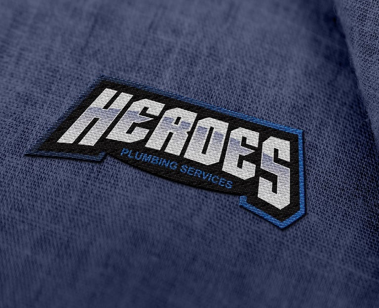
EMBLEM LOGO
Given that the brand is called Heroes, I designed the entire visual identity to reflect the look and feel of the comic book and superhero universe. The wordmark was crafted to resemble an emblem, enhanced with vibrant gradients that align with the color palette typically found in plumbing tools. The result is a bold and dynamic design that communicates sharpness, cleanliness, and efficiency.
MONOCHROMATIC VERSION
An emblem logo must perform well across a wide range of applications, many of which are limited in the number of colors they can support. That’s why I always develop monochromatic versions—ensuring the logo remains versatile, recognizable, and effective in any context, from print to social media and beyond.