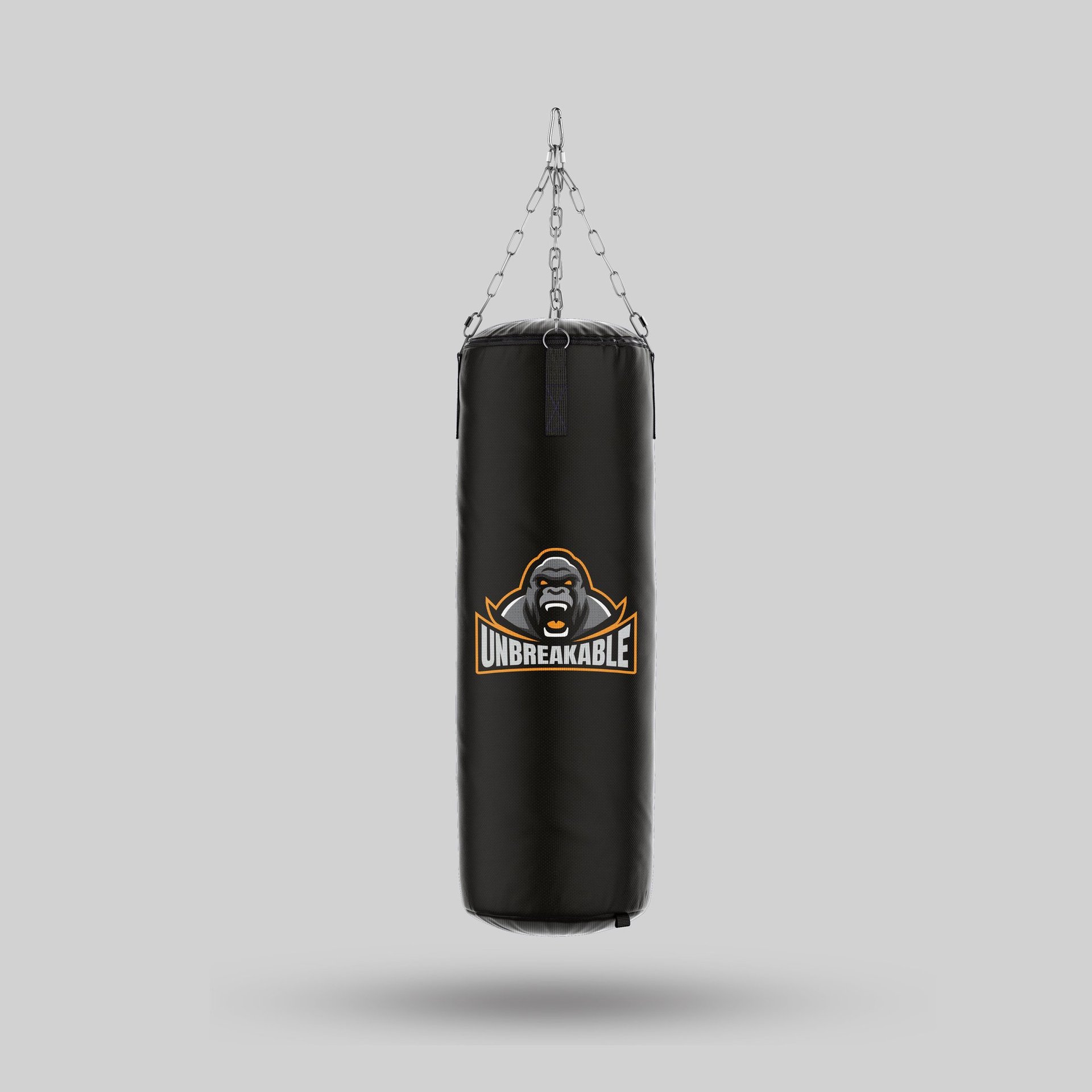
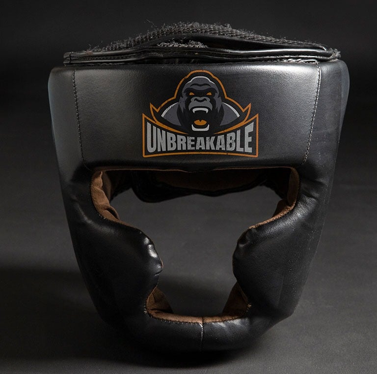
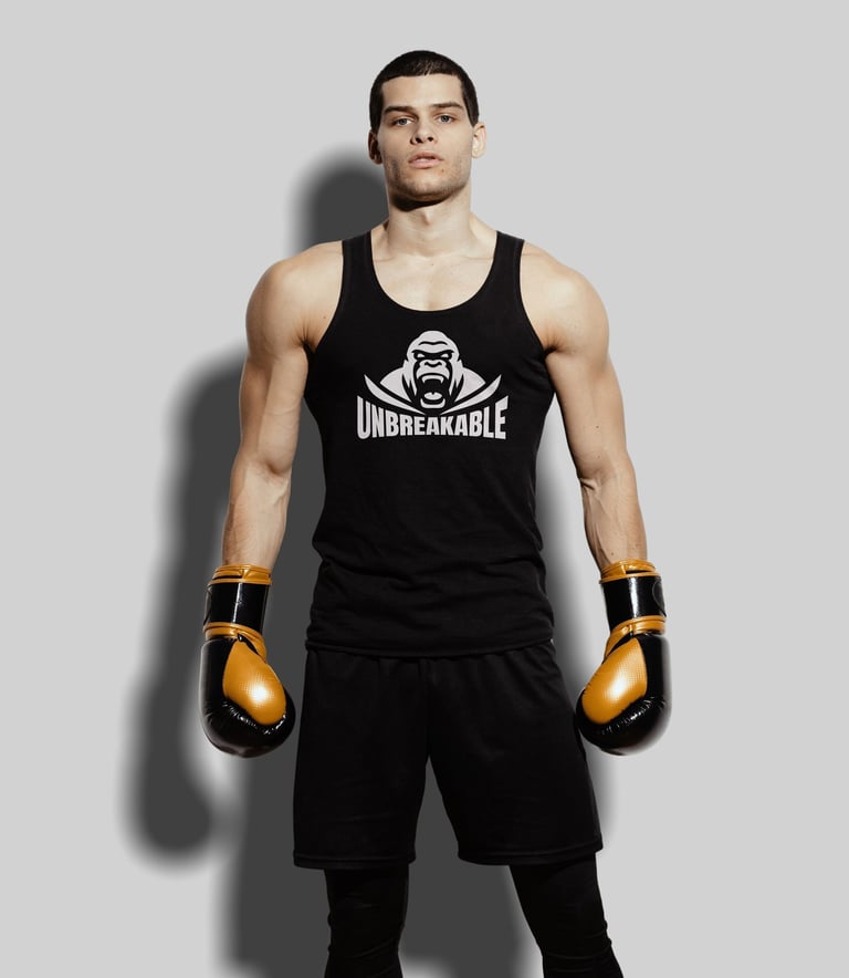
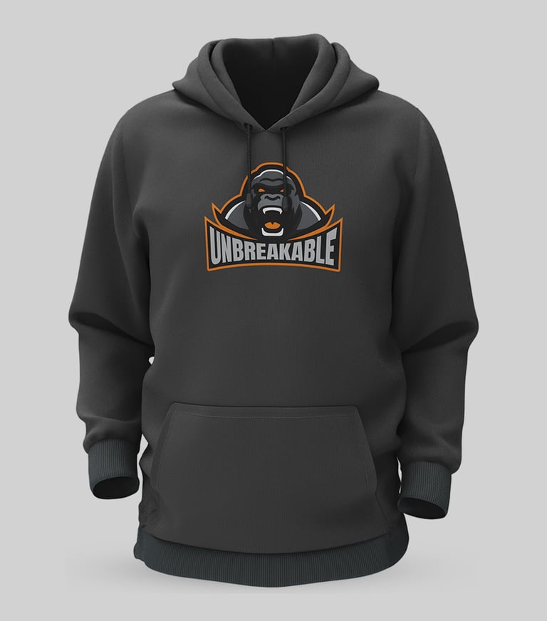
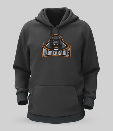
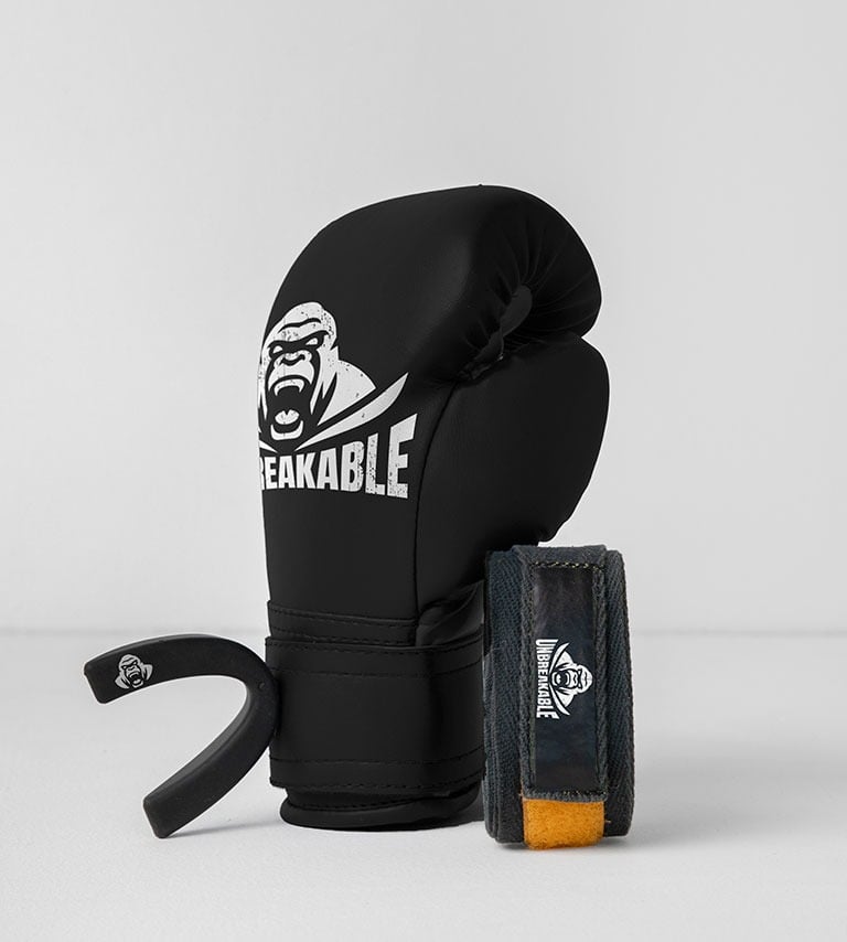
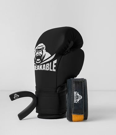
Unbreakable began as a company focused on producing mouthguards for boxing. Recently, they decided to update their logo as part of a broader effort to expand their brand into the entire boxing market. With plans to offer a wider range of products—such as boxing gloves, punching bags, headgear, and more—the company is evolving into a full-scale boxing gear provider.
To support this new direction, they chose a mascot-style logo that adds character, color, and presence, while remaining clean and versatile for use across different applications.
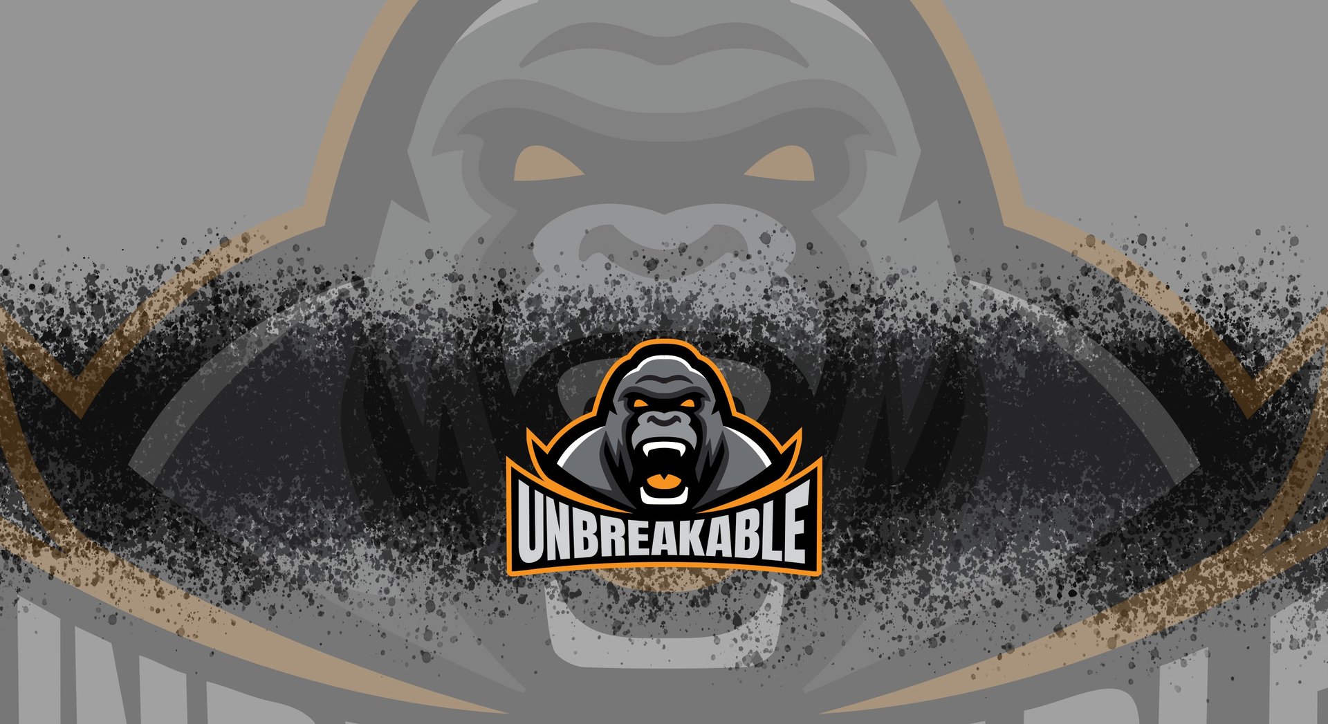
The idea of using a gorilla for the mascot was inspired by the core values the brand wants to communicate to its main audience—bravery, courage, and fierceness. I wanted clients to connect emotionally with the strength and intensity embodied by the gorilla, which also serves as a central figure within a broader visual system.
The color orange was selected for its association with energy and vitality—qualities essential to a demanding sport like boxing. This is complemented by varying shades of gray, reflecting the natural color of the gorilla and adding depth and balance to the overall palette.
The wordmark accompanying the mascot is carefully arched to follow the contours of the primary symbol. Its brighter tone ensures that the brand name stands out clearly, creating a strong, unified visual identity.
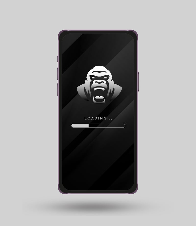
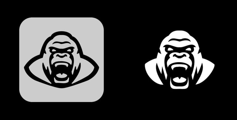
Recognizing the importance of applying the logo across a wide range of formats, I also developed a more simplified version of the design, along with positive and negative variations. When working with a mascot logo, it’s crucial to make specific adjustments to ensure it remains effective in both black and white applications. These refinements guarantee the logo maintains its impact and legibility, whether placed on light or dark backgrounds.
Finally, I created a reduced version of the logo to ensure the brand remains recognizable across all types of applications, from merchandise to social media icons and digital platforms. To maintain legibility at smaller sizes, I focused on using only the symbol, allowing the brand to preserve a strong visual connection with its target audience while ensuring clarity and impact across a wide range of formats.