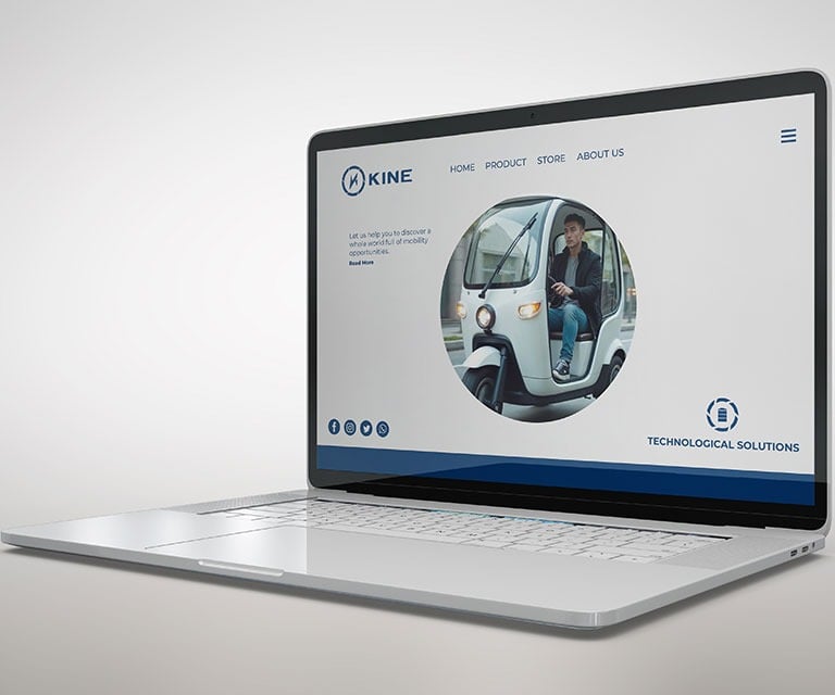
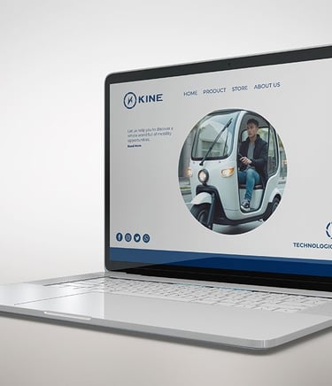
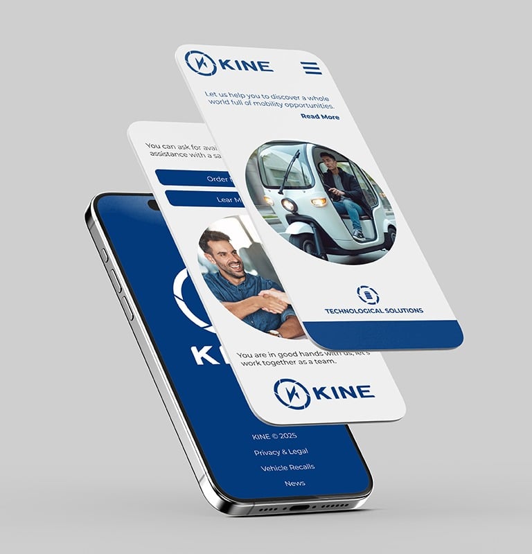
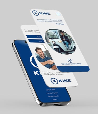
This is a new company specializing in the creation of custom electric motorcycles, bikes, and vehicles tailored to individual needs—offering versatile transportation solutions for a wide range of users. Beyond mobility, the brand champions a clean-energy future, where technology empowers people to reach new goals through sustainable innovation.
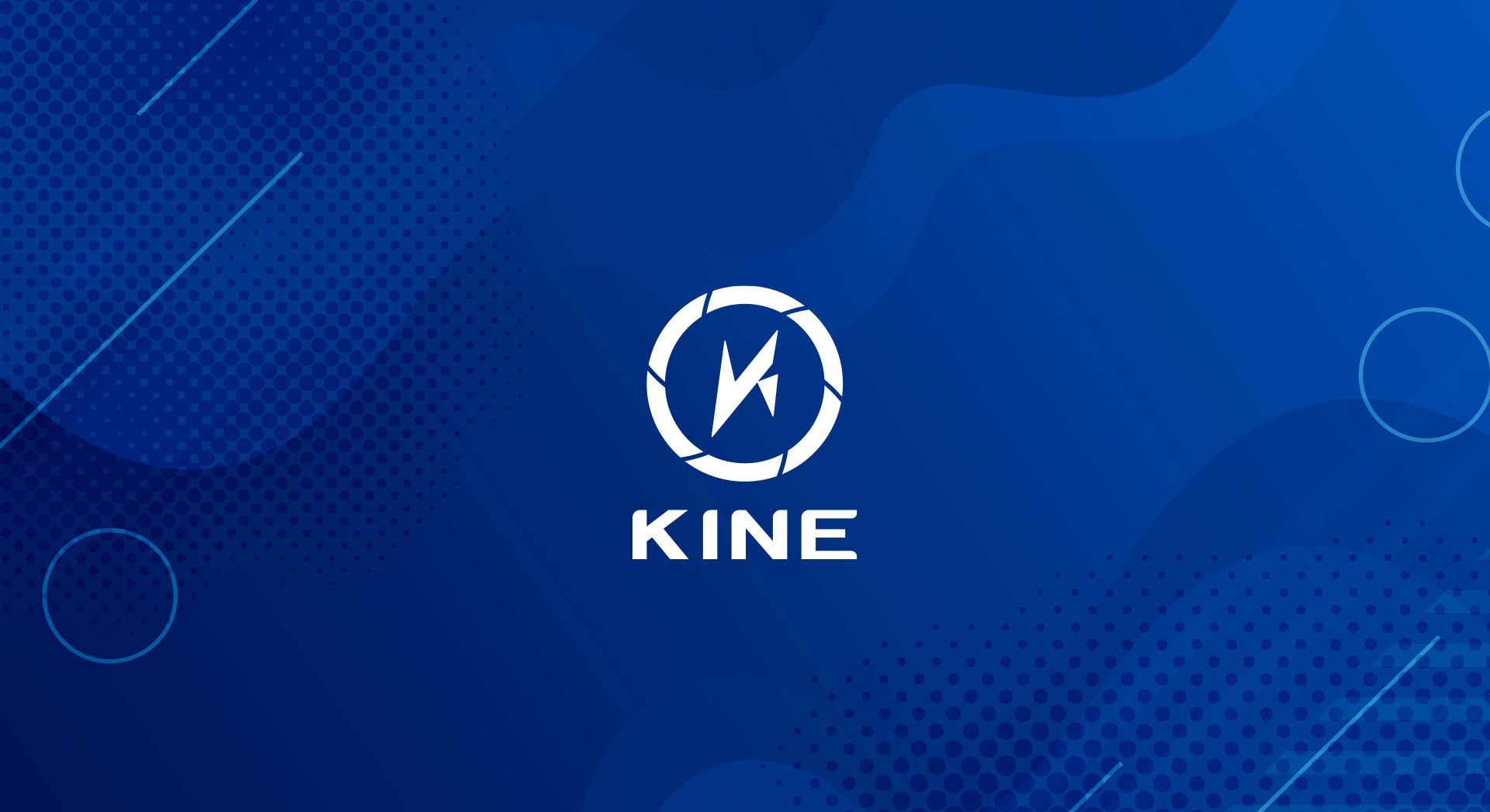
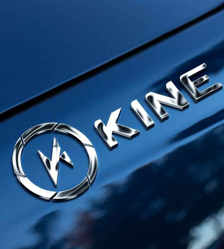
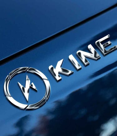
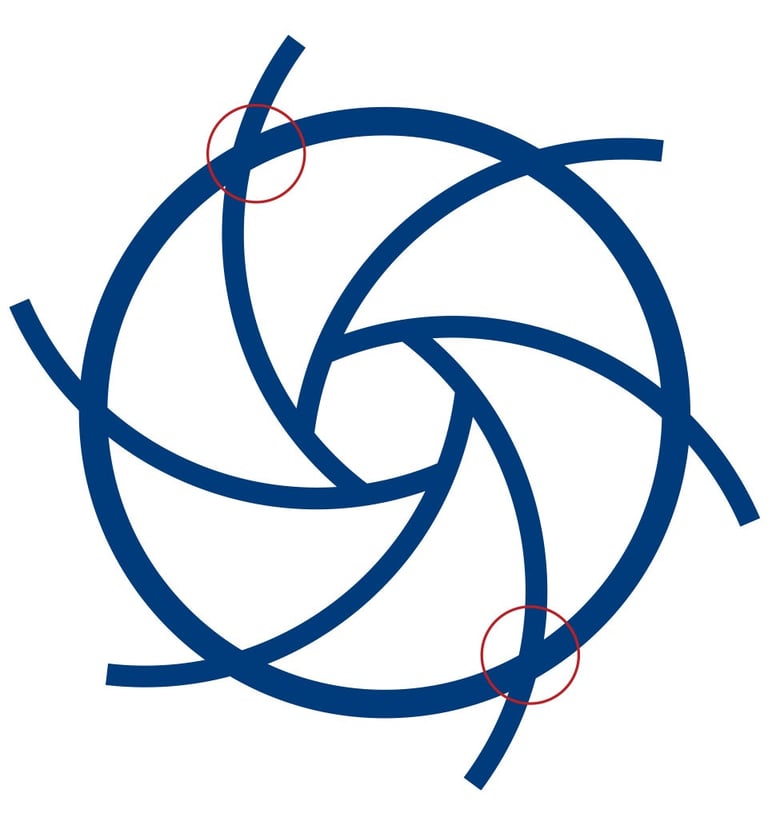
I was tasked with designing a logo inspired by the concept of helical gears—symbols of movement, precision, and innovation. This idea is represented by a circular form encircling the letter “K,” constructed using the universally recognized lightning bolt symbol. The result is a bold, modern mark that reflects both the brand’s electric essence and its commitment to clean, efficient motion.
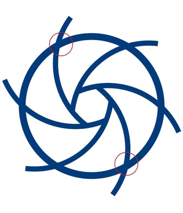
SYMBOL (INTERNAL SECTION)
Given that the company is rooted in sustainable energy sources such as electric power, the client requested that the logo incorporate elements of the lightning bolt symbol. To achieve this, I constructed the mark using a precise grid, carefully emphasizing the sharp, angular terminations characteristic of the lightning motif. I then rotated the form slightly to align more closely with the natural slant of a standard letter “K,” resulting in a cohesive and dynamic symbol that reinforces both the brand’s identity and its connection to clean energy.


SYMBOL (EXTERNAL SECTION)
The circular element surrounding the main symbol is inspired by the internal structure of an AC motor, which typically features copper windings arranged in a helical form. I aimed to reflect this dynamic, spiraling motion through the design of the circle—capturing the essence of movement, energy flow, and mechanical precision while reinforcing the brand’s connection to electric mobility and innovation.
WORDMARK
The typography selected to accompany the pictorial mark is the "Arial Bold" typeface. To create visual harmony with the symbol and convey a sense of dynamism, I rounded most of the top corners of the letterforms. Additionally, slight adjustments were made to the kerning to enhance readability and ensure a balanced, cohesive appearance across different applications.
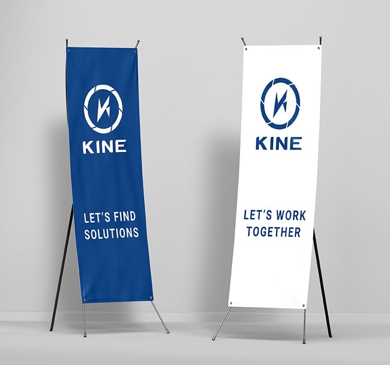
The final logotype performs exceptionally well at reduced sizes and maintains its clarity and impact in black-and-white applications.
COLOR AND BLACK AND WHITE REPRESENTATION
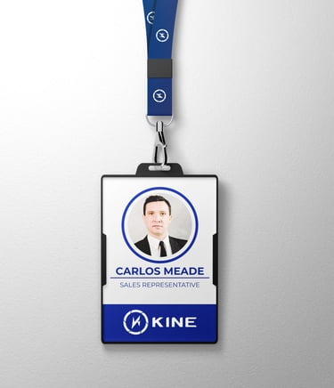
The blue color Pantone 661 C was chosen to represent the technological aspect of the company. According to color psychology, this shade of blue also evokes a sense of trust and reliability—qualities the brand aims to convey in its connection with customers.
The logotype retains its effectiveness in both black and white applications, as it was intentionally designed to perform well in single-color formats.