


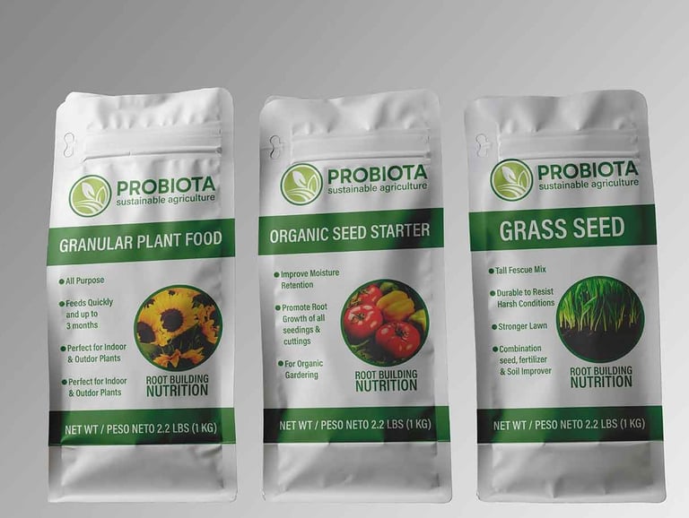
This company, based in Oaxaca, Mexico, began its journey producing organic fertilizers. As it grew rapidly, it expanded its product line to include a variety of natural offerings—now providing organic options such as hibiscus and ginger infusions.
I was commissioned to create a logo that captures the essence of natural resources and products emerging from the earth, reflecting the brand’s deep connection to sustainability and organic growth.
The visual style of the logo is rooted in earthy simplicity, using clean lines and organic shapes to evoke nature’s harmony. The color palette draws from natural tones—rich and warm greens—reinforcing the brand’s authenticity and environmental focus. The overall design is approachable yet grounded, making it adaptable across packaging, print, and digital platforms.
WORDMARK LOGOTYPE
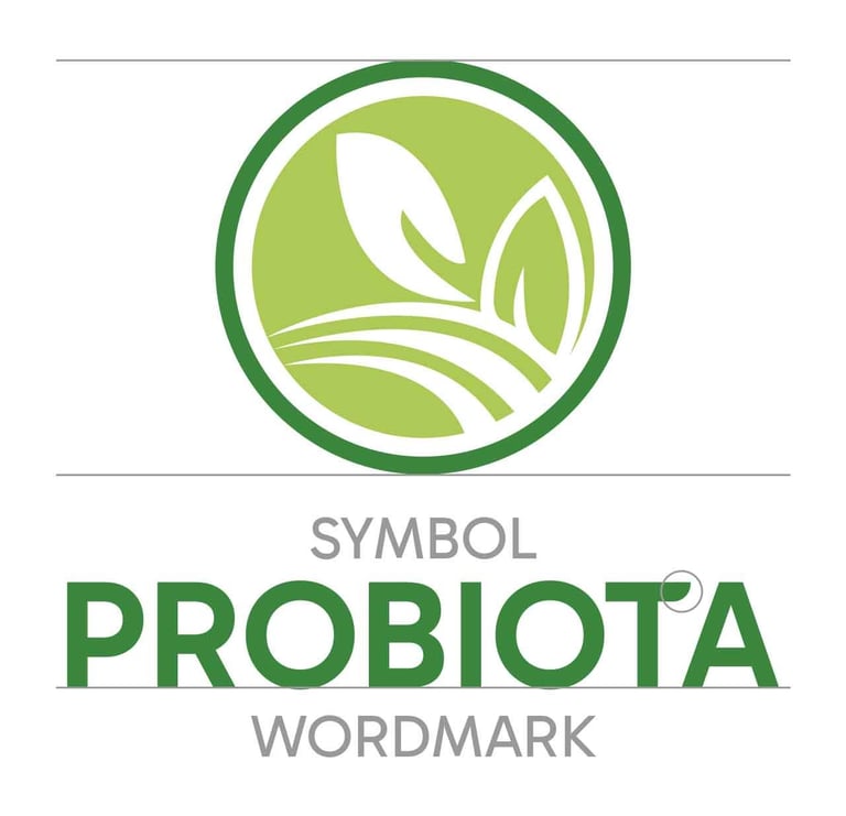
Probiota’s visual identity is composed of two key elements: the symbol and the wordmark.
The symbol represents a harvest emerging naturally from the land—symbolizing the result of care, patience, and harmony with nature. Probiota’s products are rooted in natural processes that support the earth, helping plants and fruits flourish without force—just guidance and nourishment.
The wordmark is based on the “Gabarito” typeface, chosen for its organic structure and the pleasing symmetry of its circular letterforms, especially the “o.” Carefully adjusted kerning gives each letter space to breathe, ensuring optimal legibility at all sizes—particularly in smaller applications.
For the tagline, I chose the “Acumin Variable Concept” typeface for its excellent readability and visual consistency. Its clean, modern lines provide a balanced contrast to the rounded forms of the primary typography, creating a harmonious and professional overall composition.
COLOR SCHEME
To complete the brand’s identity, I selected two complementary hues to enhance the symbol. The darker green emphasizes the inner elements of the symbol, adding depth and contrast in its full-color representation. This subtle variation creates a balanced and visually engaging palette that reinforces the brand’s natural essence.


MONOCHROMATIC REPRESENTATION
The visual identity also performs effectively in monochromatic applications, with the logotype rendered in black or white. This flexibility allows it to adapt seamlessly to the established color palette, as well as to various contexts such as full-color backgrounds used in marketing materials and branded content.