

SYMBOL
The company asked me to develop a logotype inspired by the concept of kindness in service.
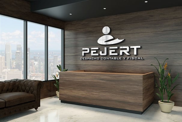
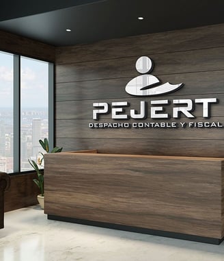
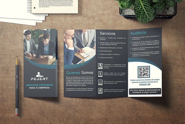
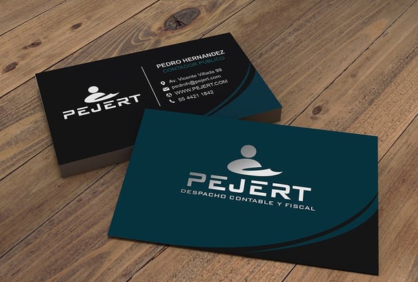
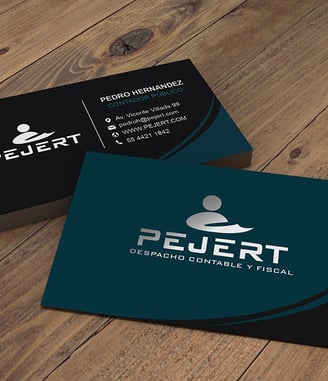
After conducting an in-depth analysis of their corporate clients and brand positioning, I proposed a refined, monochromatic logo that could be seamlessly applied across a wide range of formats and materials.
The symbol draws from the simplicity of a human pictogram, representing a person offering a warm, welcoming gesture—capturing the essence of approachability and client-focused service.

WORDMARK
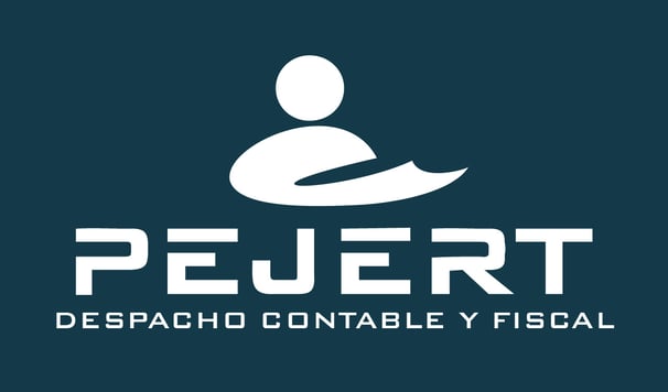
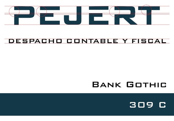
The typography selected to accompany the pictorial mark is the "Bank Gothic" typeface family. A subtle modification was made by trimming the left side of the letters P, E, and R, adding a touch of dynamism and sophistication to the wordmark while maintaining its modern and structured appearance.
COLOR
To maintain the concept of simplicity, I developed a visual identity using a single, easily recognizable color—ideal for one-ink printing solutions. The chosen Pantone 309 C conveys a sense of tranquility and sophistication, perfectly aligning with the brand’s calm and professional tone.
A prominent accounting and law firm based in Mexico City, serving clients since 1995. Over the years, the company had frequently updated its logo in response to changes in its legal name, which affected brand consistency and recognition. I recommended establishing a single, unified commercial name to anchor a cohesive visual identity. This strategic move allowed them to build a strong, recognizable brand presence and foster deeper engagement with their clients, as well as greater visibility within the accounting and legal sectors.
